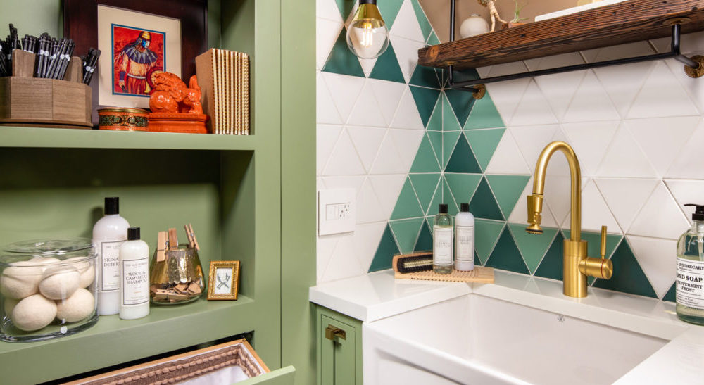
The Pasadena Showcase House for the Arts is an all-volunteer non-profit organization founded in 1948 and known for producing one of the biggest showcase houses in the country each year. The 2020 Pasadena Showcase House of Design is a Federal Country estate in Arcadia, California, built in 1937 and designed by Gerard R. Colcord, an esteemed Hollywood Society architect. Each room in the Federal-Revival home was designed by 17 different interior designers, including Jake Galang of Ilustracion by Jake, Corp, who transformed the former sewing room into a beautiful and highly functional laundry room. Check out our discussion with her here:
Is this your first time participating in the Pasadena Showcase House?
Yes, this is my first time participating on my own and I loved the whole experience. It gave me a chance to be myself and self express. Years ago when I was working for my mentor and her partners, they were part of it and although I had a taste of what it is to be involved in a showhouse, it is different when you are at the forefront and the driving force on the creative side.

How did you come up with the design vision for the upstairs laundry room? Did the owners have specific requests for that space?
Walking through the house, I was immediately drawn to the symmetry of this room. The dormer window was perfectly centered within the space and that was part of the architectural detail. The existing cabinetry was so charming, but we needed to make it more functional. I kept the footprint of the Millwork and further enhanced the window by adding a built-in bench. We were given an option to either convert the former sewing room/nursery to a craft room or a second laundry. I gave conceptual and detailed drawings for both but at the back of my mind I was thinking it would be good if [the owners] picked laundry, as my design and palette would be unexpected and not a typical one. The owners opted for the latter.
How would you describe your design aesthetic in general? How does it compare to the style of the showcase home?
My design aesthetic is a juxtaposition of period styles with new trends. [Pasadena] Showcase 2020 is a 1937 Federal Country estate. As you wander around the house, the details on cased openings, stringer on stairs, hardwood floor patterns, dormer windows, full wallpaper on walls and ceilings gives a vintage vibe. To give it a fresh look and a nod to sustainability, I added Bohemian geometric patterns and Satin Brass accents. I merged it with a classic palette, millwork and hardware.

What drew you to Waterstone’s Contemporary PLP Faucet? Which finish was used and why?
I am completely taken by Waterstone’s PLP faucet as it has a sleek base and the spout has a continuous, smooth line that ends with an industrial look, pulldown spray. Vintage + modern, right?! Another plus is the height. I purposely placed the farm sink near the window for natural light but I had to deal with the sloped ceiling. I am very familiar with Waterstone as I use it a lot for my custom projects. I know they have different faucet heights and types from the same collection. I used the 16” high Contemporary PLP in Satin Brass finish as it works with my cabinet hardware and lighting. Sustainability is another reason I chose Waterstone. It is made in USA which lessens the carbon footprint, and I have been to the factory and have seen each part being made, finished and put together painstakingly.
The door to the laundry room is very unique, having built in shelves and a hidden pullout hamper. What are some of the other organizational features that you included in the room’s design?
With roughly only 140 square feet of space, I added a recessed ironing board on the wall, stacked the compact size washer and dryer, pullout storage at sink and lots of open shelves, pigeon holes and full height cabinets.

Did you encounter any obstacles or challenges when designing the space? If so, how did you work through them?
We have a limited space and there was no existing plumbing, venting for appliances as it was a Sewing Room. But working with the right team and having good resources helped me develop the design. I stacked a compact size washer and ventless dryer. For plumbing I used the Contemporary PLP prep size faucet which gave me space to add a floating shelf above the sloped ceiling. I made use of every inch and did vertical storage.
Do you have advice for others who might be renovating a laundry room? Are there any specific details (like a faucet) that shouldn’t be missed?
Selection of appliances and plumbing is a significant phase in renovation. Make sure you know the story behind the brand and check for reviews and reputation. Specifically with a faucet, this is the most abused fixture in a laundry. It has to withstand constant handling, can quickly change the temperature from hot to cold or vice versa. You need to consider the size, style, finish and what functions you need. Not only does it have to look good but it needs to feel good.


