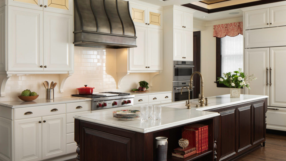
Designer Natalie Erickson from architecture and interiors firm Deep River Partners recently completed two renovation projects in Milwaukee: one a sleek and modern waterfront pied-à-terre, and the other a traditional Gothic Revival. The former, Harbor Front Renovation, is an industrial condo located in Milwaukee’s historic Third Ward, the city’s trendy, revitalized warehouse district, while the Gilded Age Restoration was an 1890s home refresh meant to bring modern functionality while honoring its history. Natalie joined us to discuss her experience designing these kitchens with distinct design (and faucet) needs
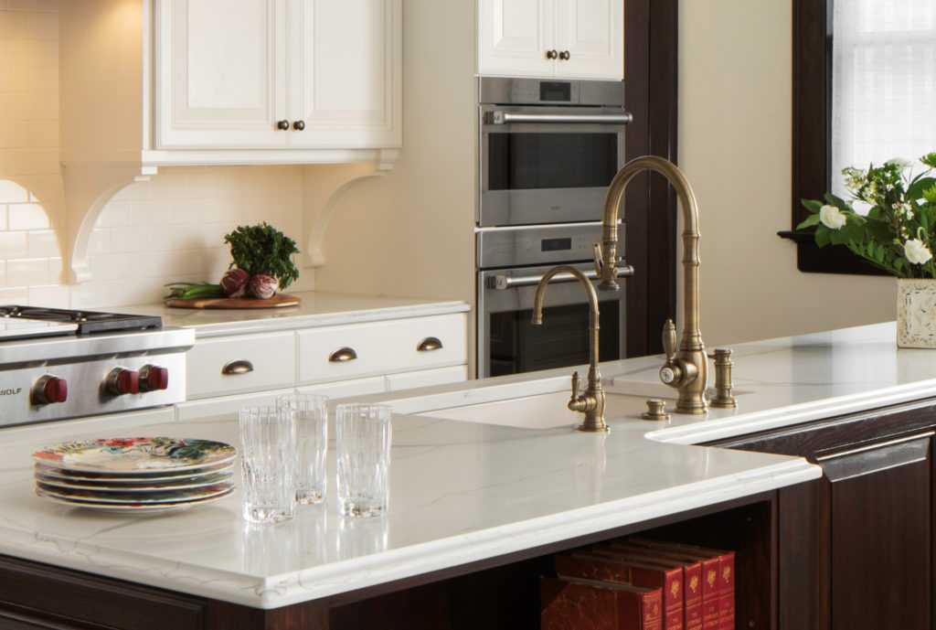
Architecture and Interior Design by Deep River Partners, Ltd. and Photography by Ryan Hainey Photography
What did each home look like before the renovations?
Harbor Front Renovation: the interiors of this existing condominium were a bit tired, which did not reflect its trendy urban neighborhood. There were shiny maple floors and cherry cabinets that dated the space, and the open concept lacked definition between the kitchen, dining and family room. The existing ceiling was maintained as an element we wanted to play up. Through changing the finishes of the interiors, the wood ceiling became more cohesive with the space and an integral part to reflect the desired industrial design.
Gilded Age Restoration: the renovation of this historic home touched all four levels and was inspired by gorgeous artisan details in the original woodwork, leaded glass, and finishes. The kitchen area was original to the house as was the floorplan, which was compartmentalized into an undersized kitchen, pantry, and butler’s pantry. The space was quite dated and lacked the features and functionality of a modern working kitchen.
What were the goals in designing each project? Were there specific requests from the homeowners?
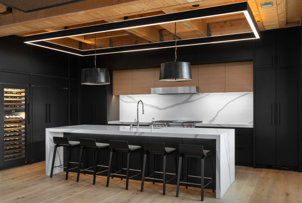
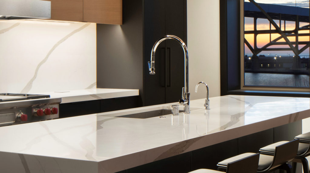
Harbor Front Renovation: As their pied-à-terre, the homeowners wanted to walk into their renovated condominium and feel they were arriving at a high-end hotel. The design solution balanced the urban setting with the desired modern industrial theme comprised of a refined palette of black, white, and rift cut oak, with metal and concrete industrial accents. The new kitchen design brought better function and balance with the introduction of a strong centerline maintained by the range and sink as focal points. The black cabinets add a modern edge while white oak cabinets provide relief, and white quartz countertops marry the design elements together.
Gilded Age Restoration: The homeowners wanted to update their residence to include modern conveniences while honoring the home’s historic character. They requested a larger kitchen with a casual dining space. The design solution combined the original kitchen, pantry and butler’s pantry to deliver a modern open design for the new semi-professional kitchen and built-in banquette for casual dining. The new floorplan improved connections to the entertainment areas of the home and increased lighting to brighten the space. The home welcomed a modern refresh with a transitional aesthetic, while staying true to the integrity of the home’s historic elements.
Architecture and Interior Design by Deep River Partners, Ltd. and Photography by Ryan Hainey Photography
What are the new outstanding features in each kitchen?
Harbor Front Renovation: One of the greatest challenges was illuminating the kitchen without penetrating the existing wood ceiling or obstructing the views through the expansive windows. A rectangular LED fixture frames the island from above to define the kitchen and provides the main source of light, with both indirect ambient up lighting, and overall down lighting for cooking. Lighting underneath the upper cabinets and island counter emphasize the strong horizontal lines. The black cabinet selection provides contrast with the accent of white oak cabinetry at the upper cabinets, which really showcases the veining in the quartz countertops.
Gilded Age Restoration: Playing on the original woodwork, leaded glass and finishes were inspirations for the more striking details in this refreshed design. Molding profiles and dark floors were continued into the kitchen for contrast with the new light cabinetry and countertops. Lighting elements in the leaded glass upper cabinets and ceiling further brighten the space. For a historic feel, the ceiling was enhanced with coffers and a faux finished wall covering to create the look of pressed tin. Cove lighting highlighted the new detail. A custom hood crafted with rivet details give a historic nod and provides a dramatic visual to the space.
Which PLP faucets and finishes were chosen and how do they contribute to each kitchens’ design?
Harbor Front Renovation: With the main selections in the kitchen being black, white, or white oak, we decided on the Modern PLP in Chrome to add some jewelry and shine to reflect in the kitchen and provide relief to the design scheme. We chose the faucet design for its clean lines and beautifully simple aesthetic.
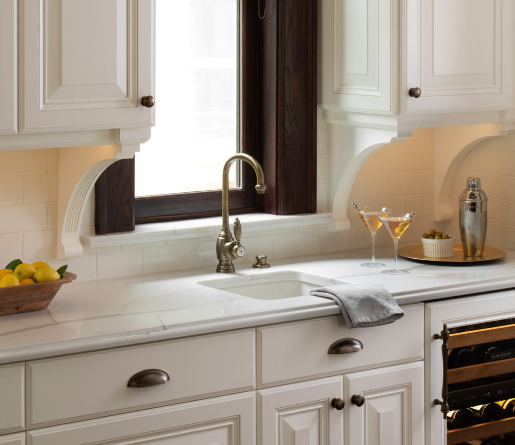
Gilded Age Restoration: We wanted a traditional faucet that looked like it could have always been with the home. The Antique Brass finish on the Traditional PLP from Waterstone is so beautiful and has just the right level of patina for an authentic look.
Architecture and Interior Design by Deep River Partners, Ltd. and Photography by Ryan Hainey Photography
How do you choose – or recommend your clients to choose – a kitchen faucet?
When recommending a kitchen faucet, we typically start by looking for a pull-down faucet for function, especially at a main kitchen sink. To complete this workstation, we prefer a collection with a wide range of accessories and finish selections. The reason we love to source with Waterstone is because of the details in the air switch, filtered water faucets, and soap dispensers. The kitchen sink is a high use area, and these small details really add up to create a beautiful kitchen aesthetic that a client typically experiences multiple times a day.
Can you walk us through the process of restoring a historic home like the Gilded Age Restoration? What are the challenges, specifically in a kitchen space?
A preservation has more considerations for the exterior of historic structures. With this interior renovation, creating modern updates within the storied walls of this century old home did present its challenges. Our design team focused to honor the original moldings, millwork profiles and detailing of this historic home. The darkly lit home needed brightening, and the existing boxy floorplan was a design for another era. Opening these spaces to reconnect the heart of the home with the entertaining areas was essential. Existing windows, doors, hallways, and stairways were also modified with respect to the home’s historic details while refreshing it with transitional appeal.
Architecture and Interior Design by Deep River Partners, Ltd. and Photography by Ryan Hainey Photography
Are there any other special kitchen details or project info you’d like to share?
Harbor Front Renovation: The new, efficient floorplan really maximizes the space to design in a full-size refrigerator and freezer, wine storage, centered range, and beverage center to cater to the entertainment needs of the homeowners.
Gilded Age Restoration: A casual dining option beyond the existing formal dining room was accomplished by taking space from a back hall and stairway to create a built-in banquette, and a new window adds natural light. The new beverage station is an update from the former butler’s pantry, and is strategically situated near the dining room for convenient hospitality.


